Overall Objective
Develop an expanded and polished visual system (color palette, typography, visual elements) that is faithful to the company’s mission and enhances its visual presence across digital and print touchpoints.
Audience
Prospective clients, including company executives, wellness fair organizers, and individuals seeking personal wellness services.
Creative Direction
✱ Modern, credible, and friendly appeal
✱ A core color palette of blue (swatched from the original logo) and yellow to highlight important details and frame vibrant event photography
✱ Rounded edges, illustrative elements + icons, and strategic white space that facilitate content comprehension
✱ Sans-serif typography for a clean and contemporary look
Website
Objective
Execute a full site refresh utilizing the newly established branding to make an engaging, accessible, and defined user experience.

The Our Experiences page invites the user to scroll through the company's wellness services with an emphasis on enjoyment and belonging.
Photography was thoughtfully selected to show various demographics and settings. Scrolling banners are featured on pages to break up large sections of static imagery and support the brand's personality. Recurring symbols, such as the radiating star (✺) and emojis, add cohesiveness and a contemporary touch to the site.
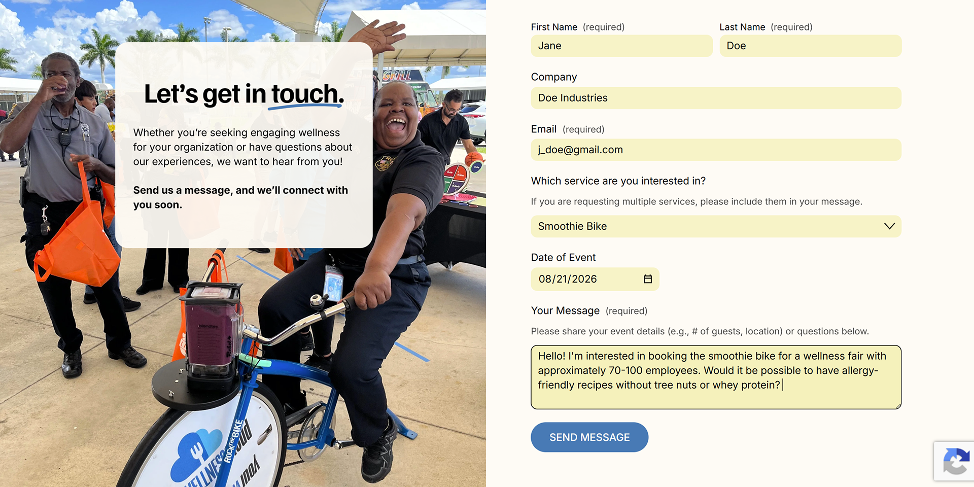
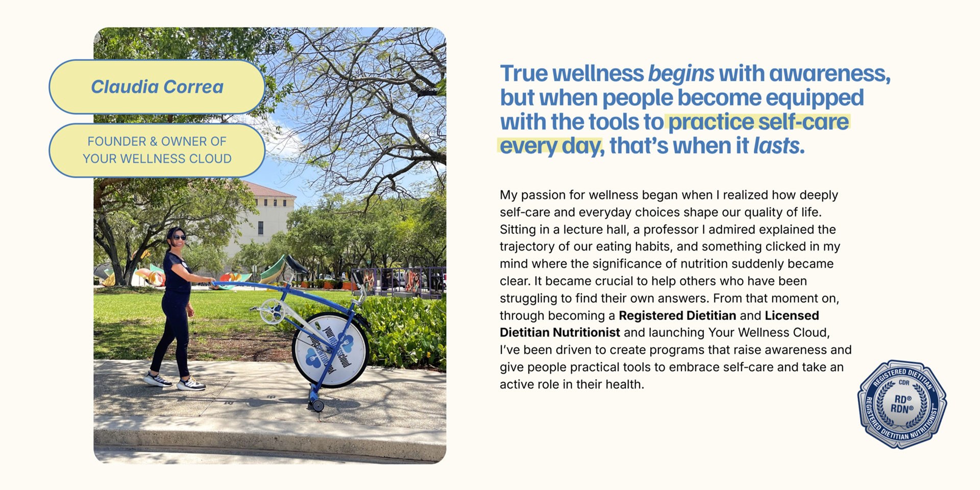
Underlined words and highlighted phrases add a human touch, showing the brand's authenticity and intentions. Titles and certifications are made clear in a collage-esque style to demonstrate credibility yet maintain approachability; medical professionals are human, too!
Explore Your Wellness Cloud's full website at yourwellnesscloud.com,
or use the button below.
↓
or use the button below.
↓
The Purpose of... Sticker Series
This mission‑driven sticker series was conceptualized by meshing together a question and an idea held dear to the founder of Your Wellness Cloud, Claudia Correa.
The question
With the ushering out of business cards, how can prospective clients today remember and share my business with their networks?
The idea
Correa had a wellness philosophy that she referred to as The Purpose of…, helping people find motivation to prioritize their health from an educational and conversational lens. Instead of simply prescribing a diet and exercise, she first encourages people to ask, “Why do we need water?” or “What makes beets so healthy?”
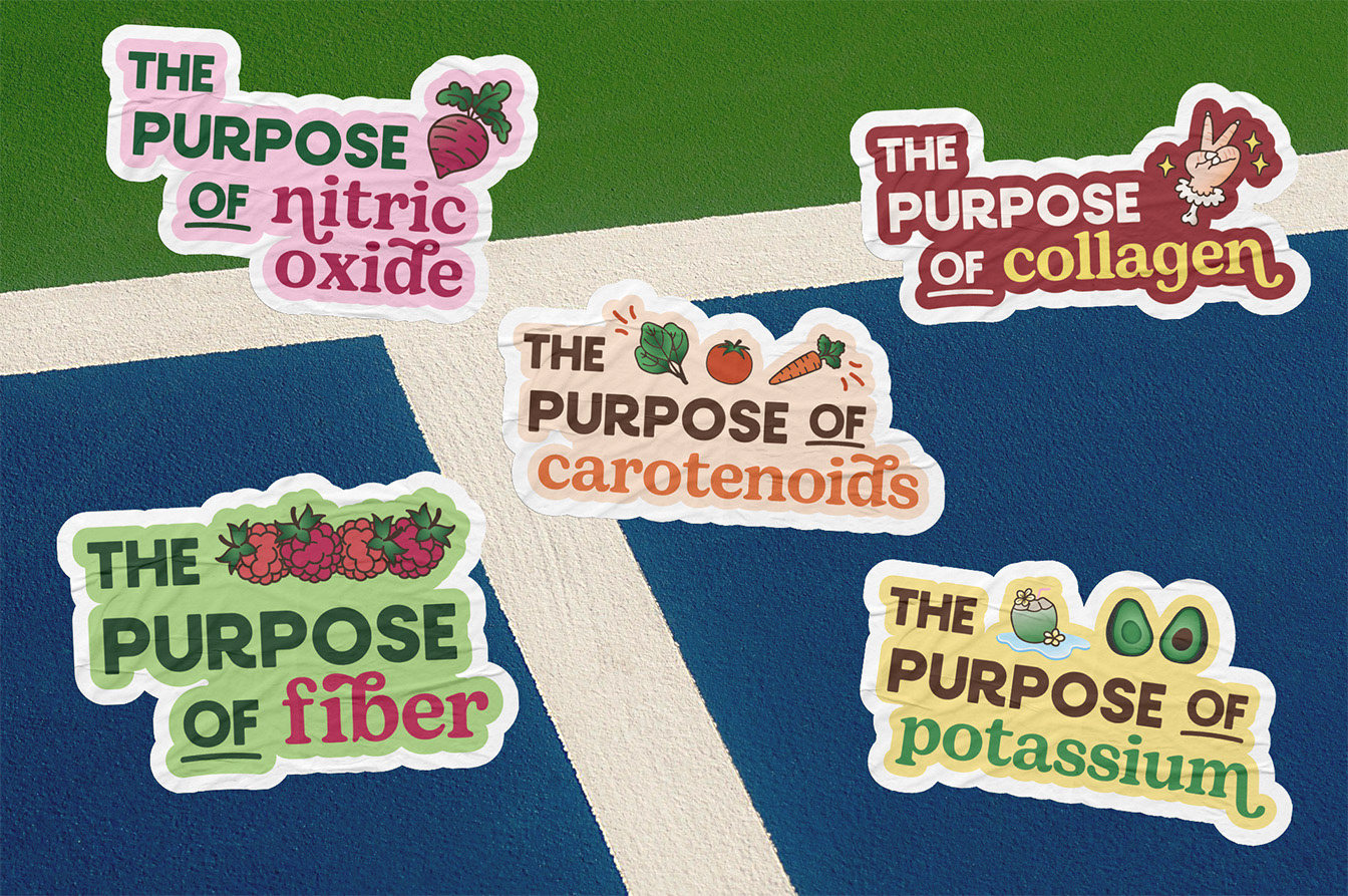
These sticker batches feature the recognizable tagline highlighting foods and their components. Ranging from collagen to creatine, they serve to grasp one’s attention and start a conversation, be it personal research, dialogue among peers, or between a client and a registered dietitian at a wellness event.
Creative direction
The inspiration behind this mission-driven concept was drawn from the sensory elements at a farmer’s market: typography that felt refined yet organic; bright colors that evoked freshness; illustrations that felt curated yet authentic.
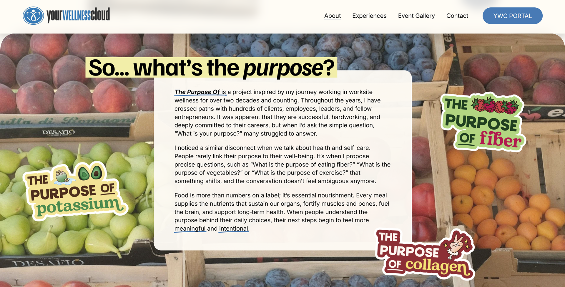
A section from the company site's About page dedicated to The Purpose of and its efforts.
Educational Content
Led by registered dietitians, Your Wellness Cloud prioritizes informing the general public of how to care for their health first and foremost. This is accomplished through small and large-scale collateral, pairing clear, accessible writing with brand-aligned visuals that communicate wellness concepts to diverse audiences.
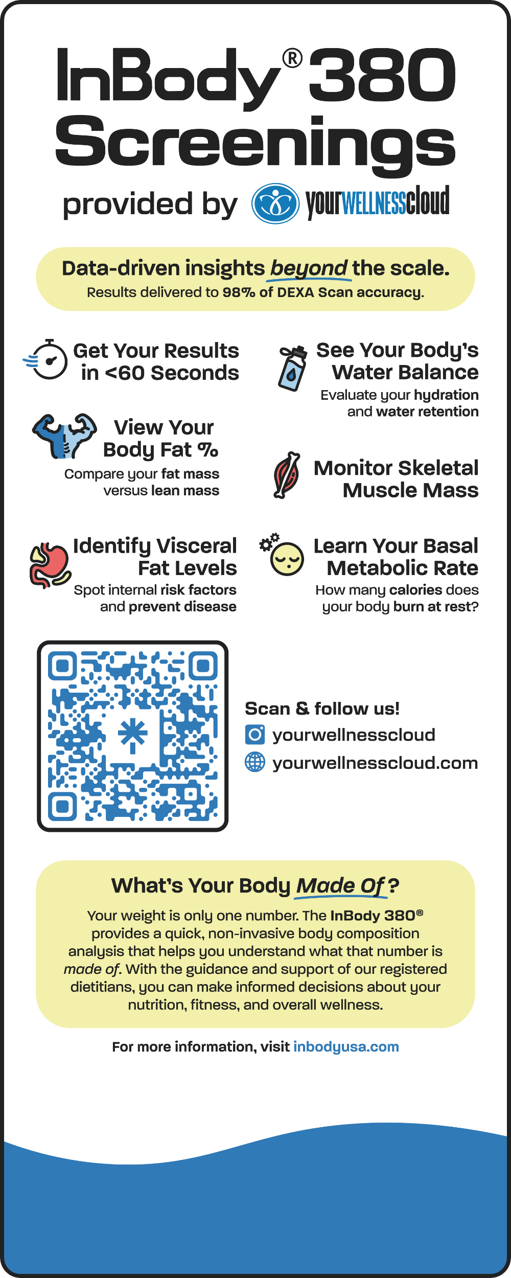
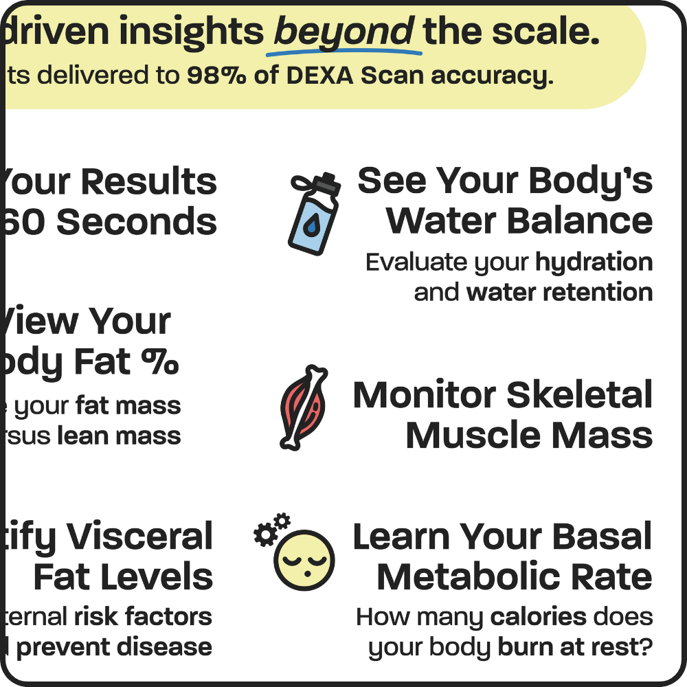
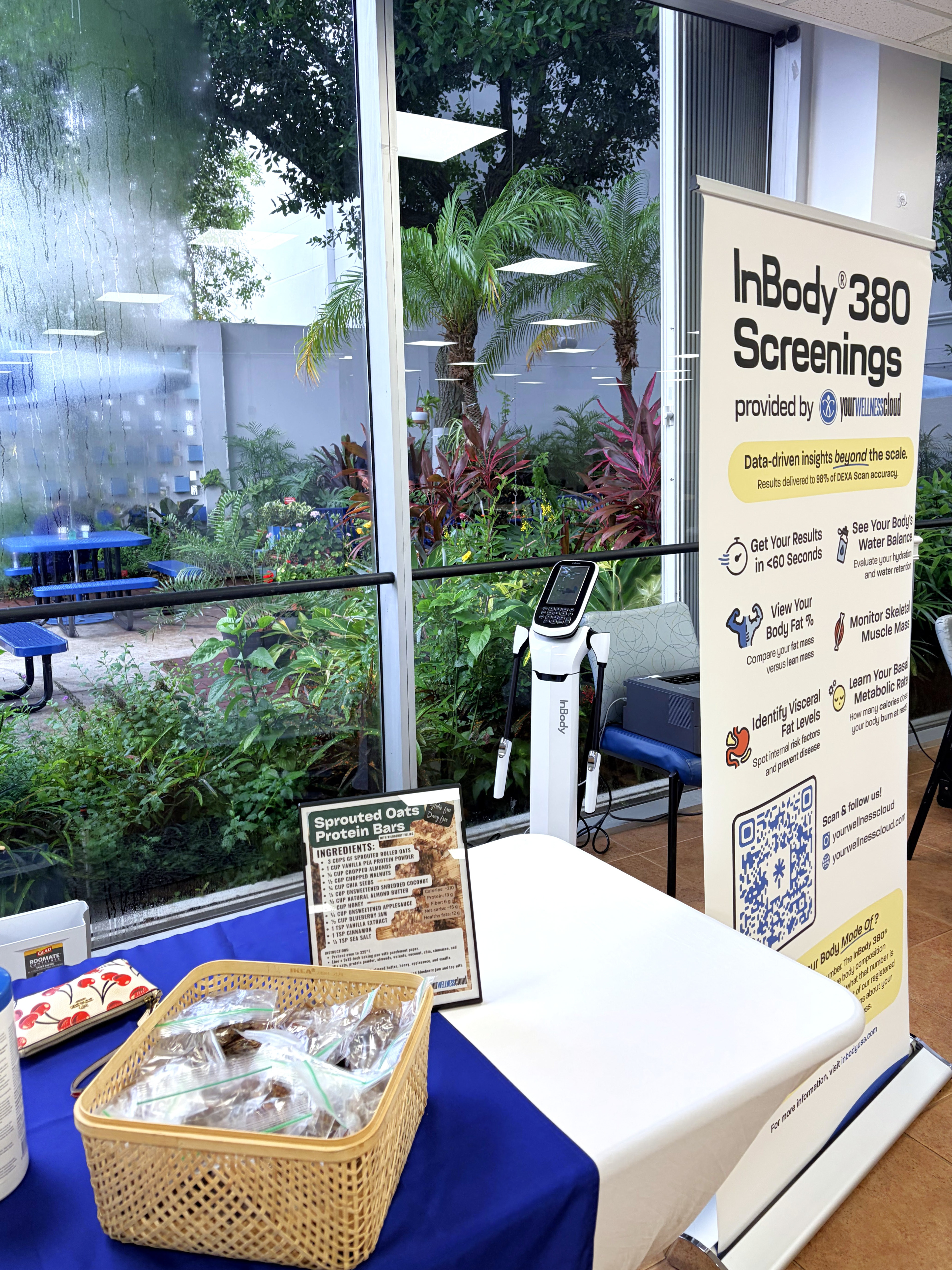
This retractable banner invites guests to participate in a full-body composition screening by highlighting key takeaways and simultaneously serving as a privacy screen for participants undergoing a scan.