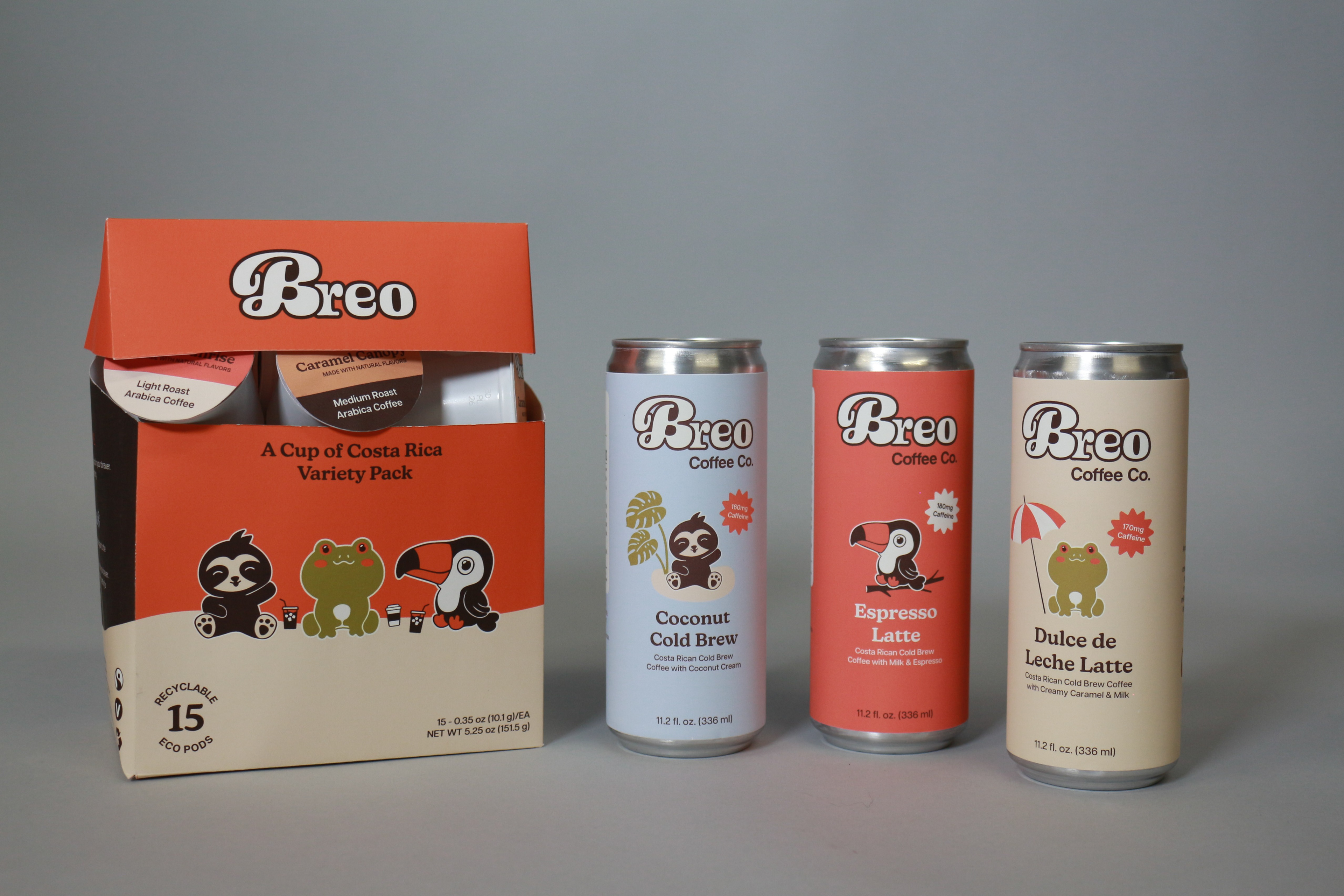
A Costa Rican coffee brand that celebrates the region’s vibrant culture through saturated, tropical-inspired visuals and friendly animal mascots, inviting consumers to slow down and savor every sip.
OBJECTIVES
✱ Create the brand identity (logo, color palette, typography, visual elements, and voice) for a Costa Rican coffee company that communicates its cultural roots and dedication to sustainability and wildlife protection.
✱ Develop products and packaging systems for retail shelves that maintain brand unity, appeal to prospective consumers, and communicate Breo's values with clarity.
✱ Develop products and packaging systems for retail shelves that maintain brand unity, appeal to prospective consumers, and communicate Breo's values with clarity.
AUDIENCE
✱ Avid coffee drinkers interested in trying new flavor combinations and authentic ingredients sourced from international regions.
✱ Packaging fanatics who enjoy trying distinguished and uniquely playful packaged items.
✱ Packaging fanatics who enjoy trying distinguished and uniquely playful packaged items.
Creative direction
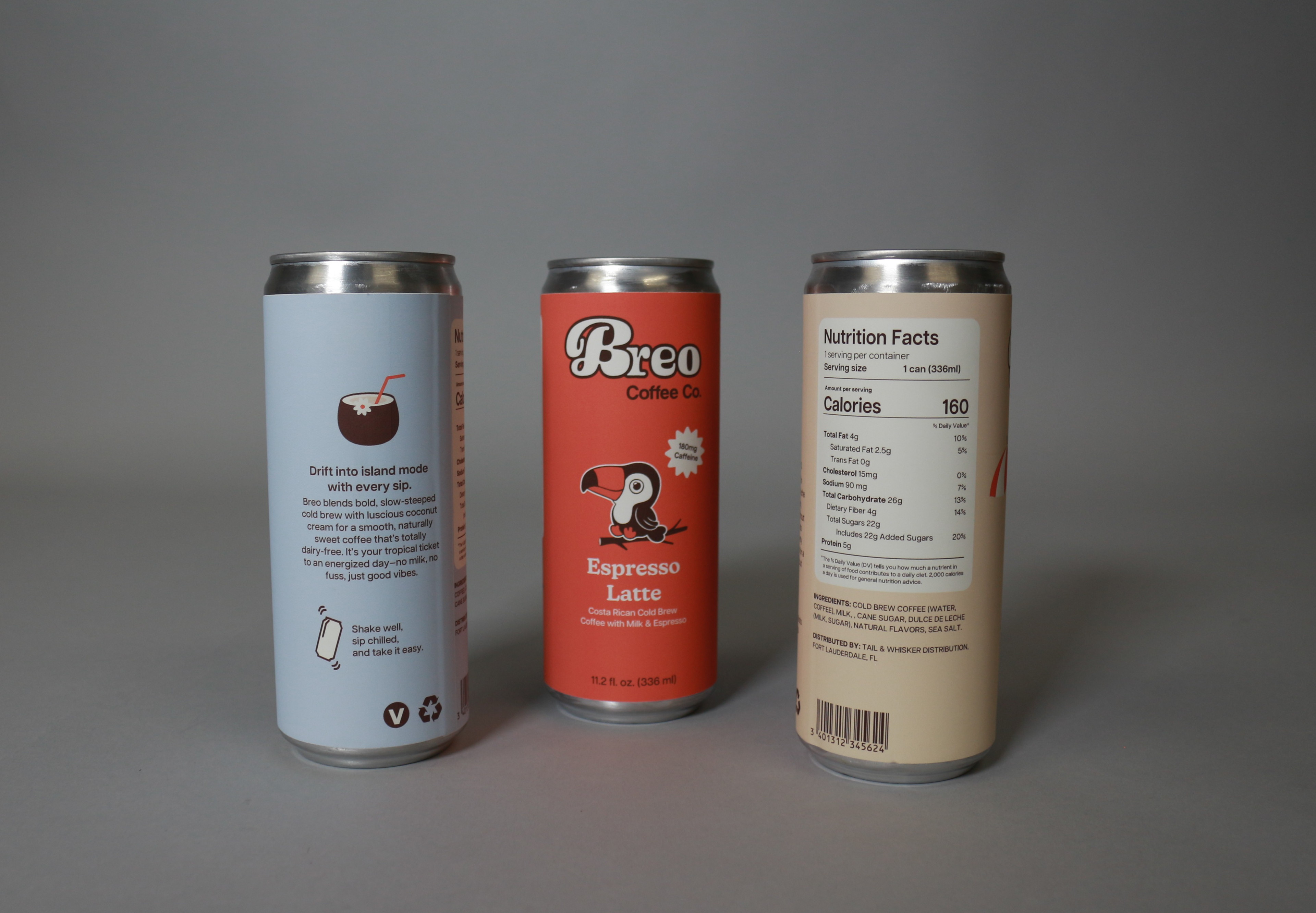
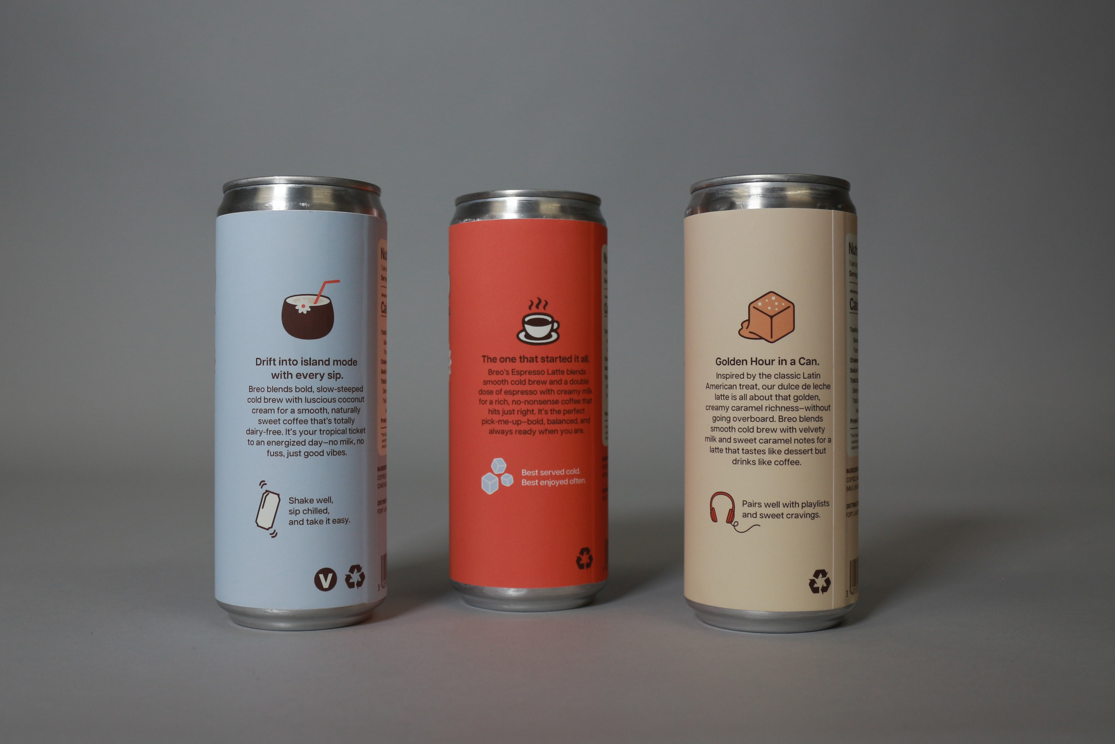
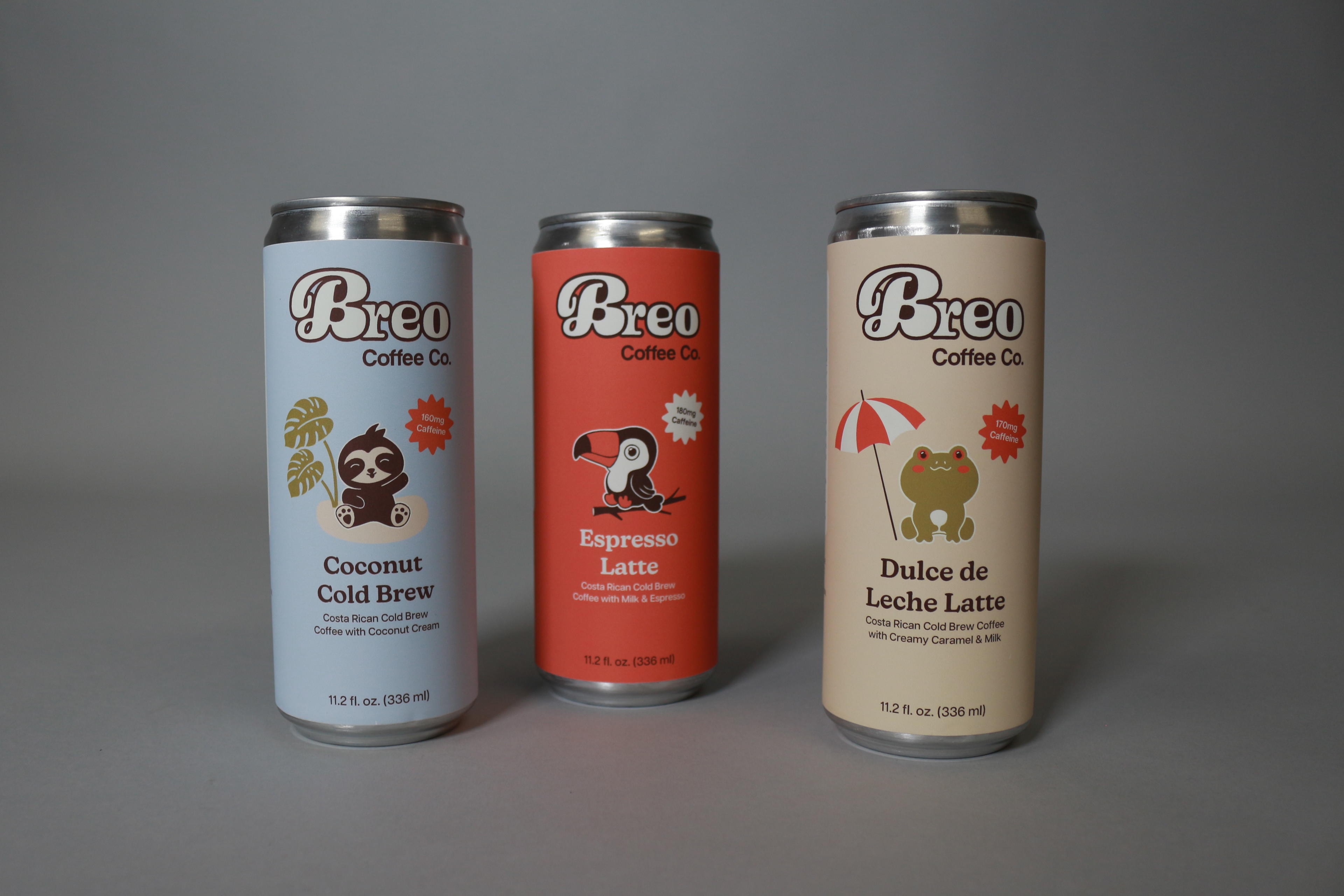
✱ Bold, fluid logotype → the moment milk splashes into a cup of black coffee
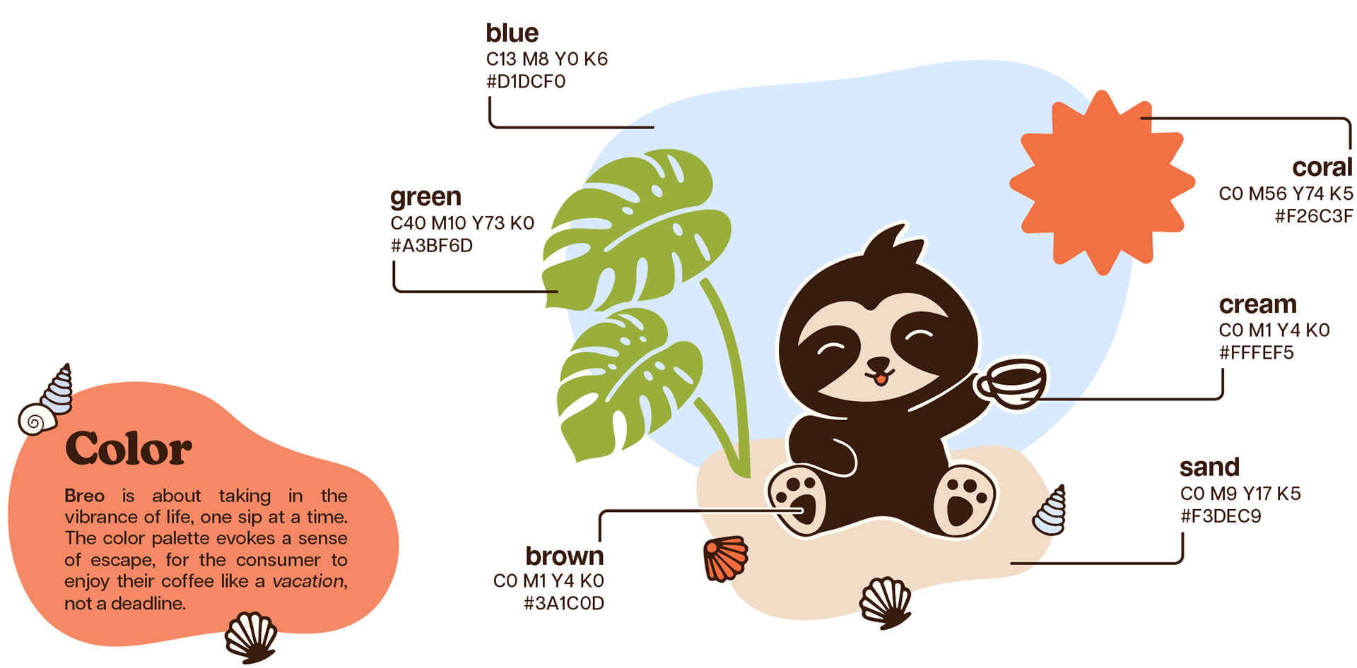
✱ Color palette captures the essence of Costa Rica’s landscape, and provides shelf visibility for product design → Blazing orange sun; calm blue ocean; lush green foliage; rich brown coffee
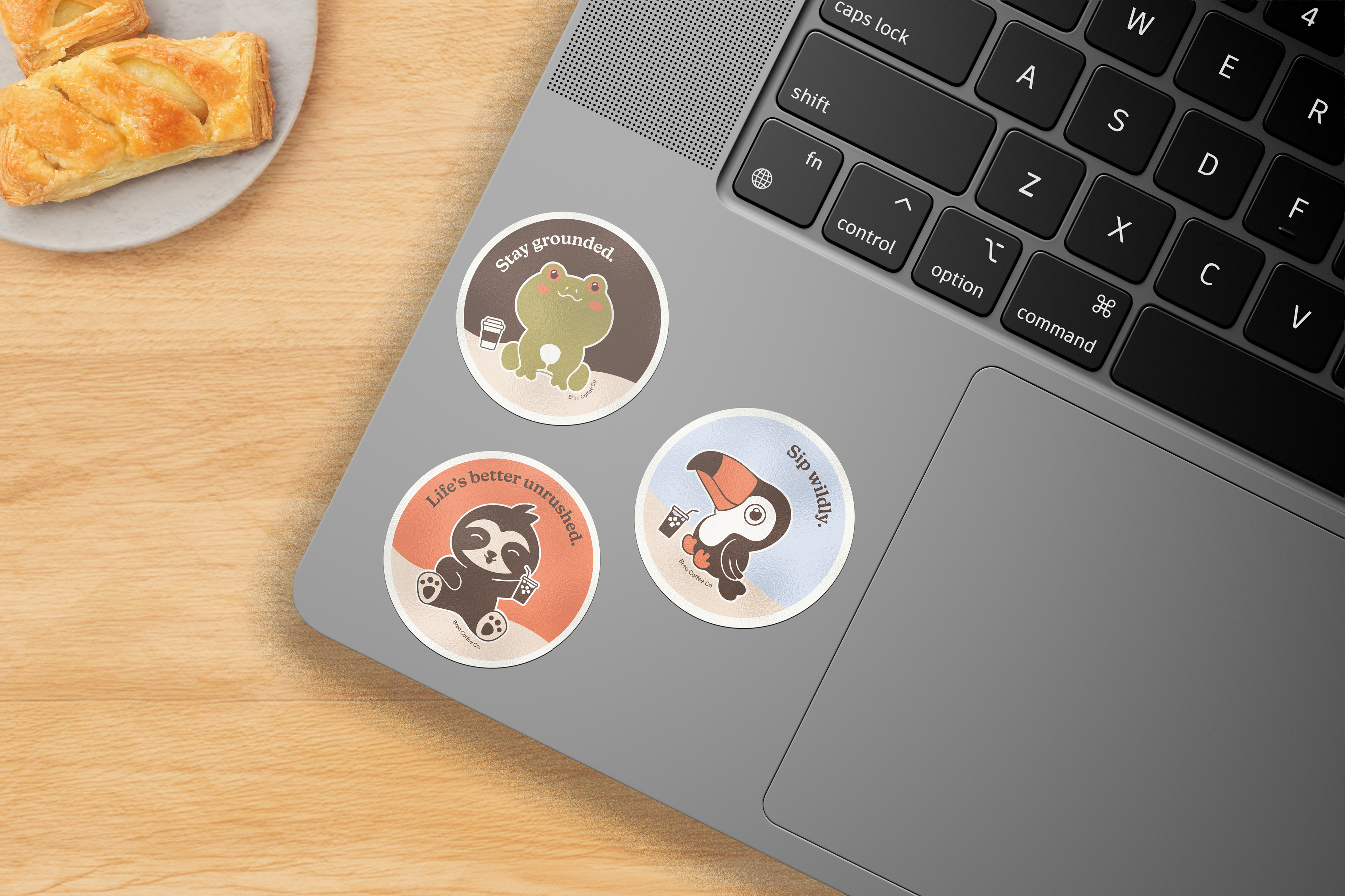
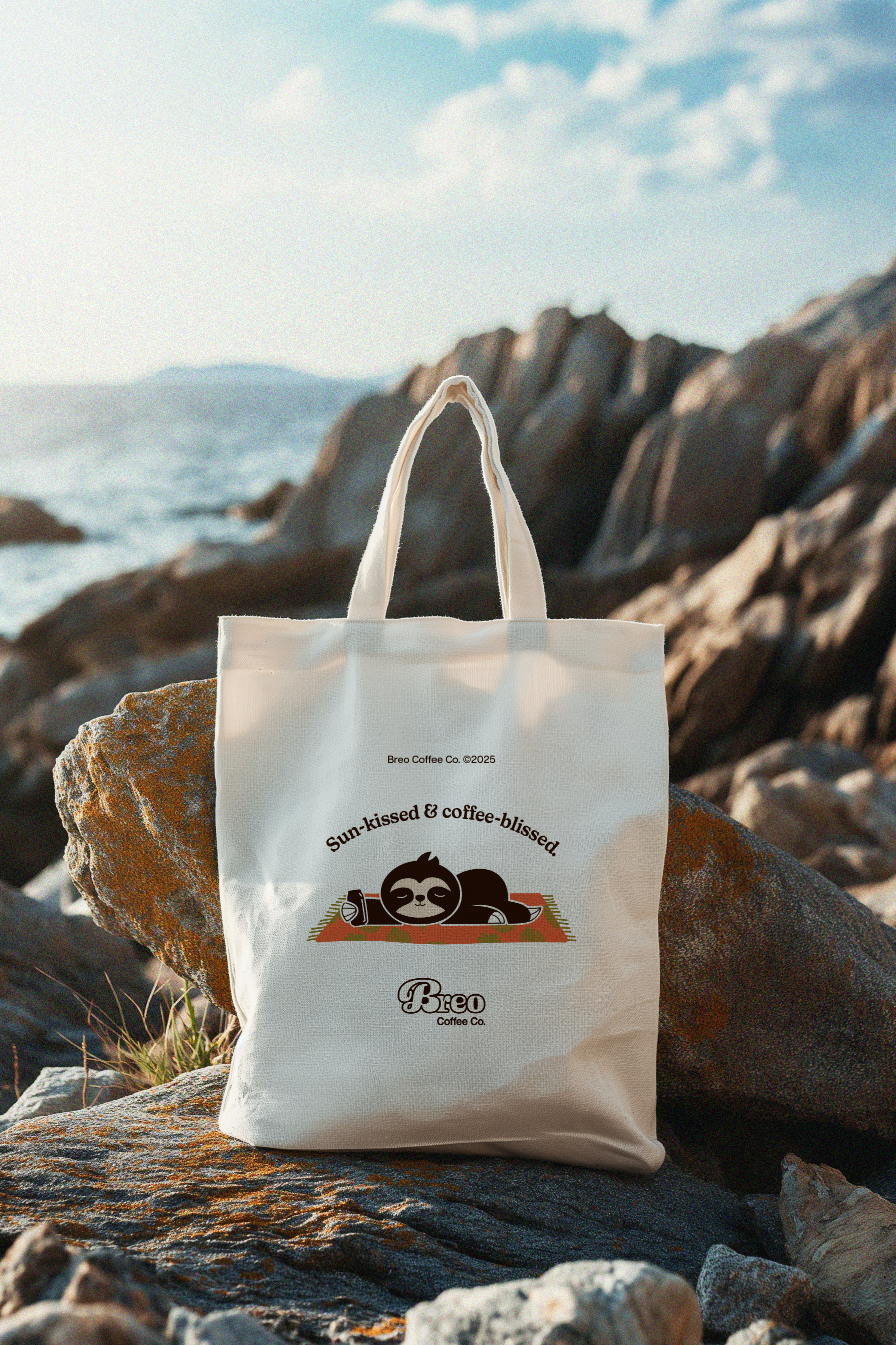
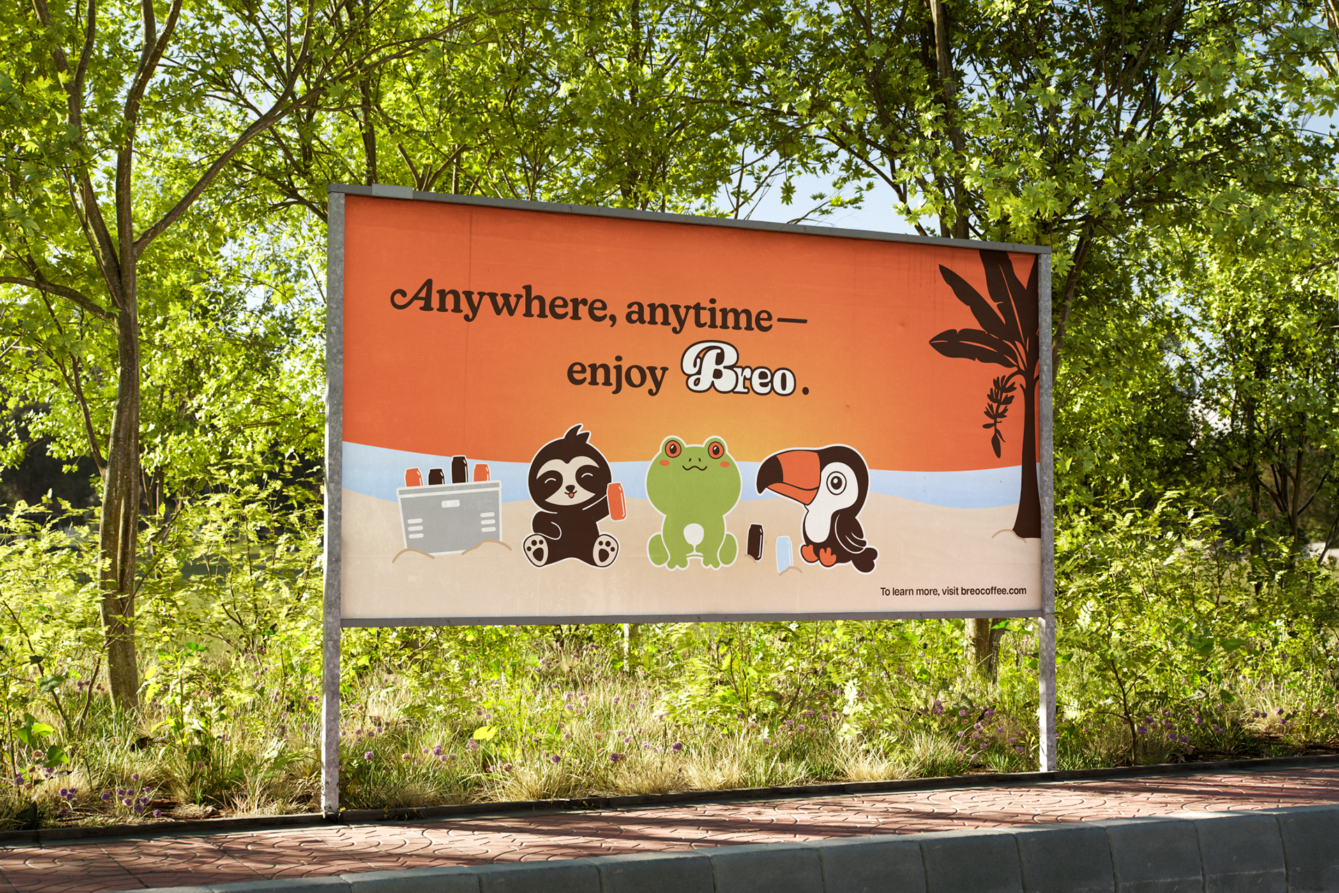
✱ Happy-go-lucky animal mascots native to Costa Rica (sloth, tree frog, toucan) for a callback to the brand's origins, and the lighthearted attitude it encourages
✱ Color palette captures the essence of Costa Rica’s landscape, and provides shelf visibility for product design → Blazing orange sun; calm blue ocean; lush green foliage; rich brown coffee
✱ Happy-go-lucky animal mascots native to Costa Rica (sloth, tree frog, toucan) for a callback to the brand's origins, and the lighthearted attitude it encourages
Packaging
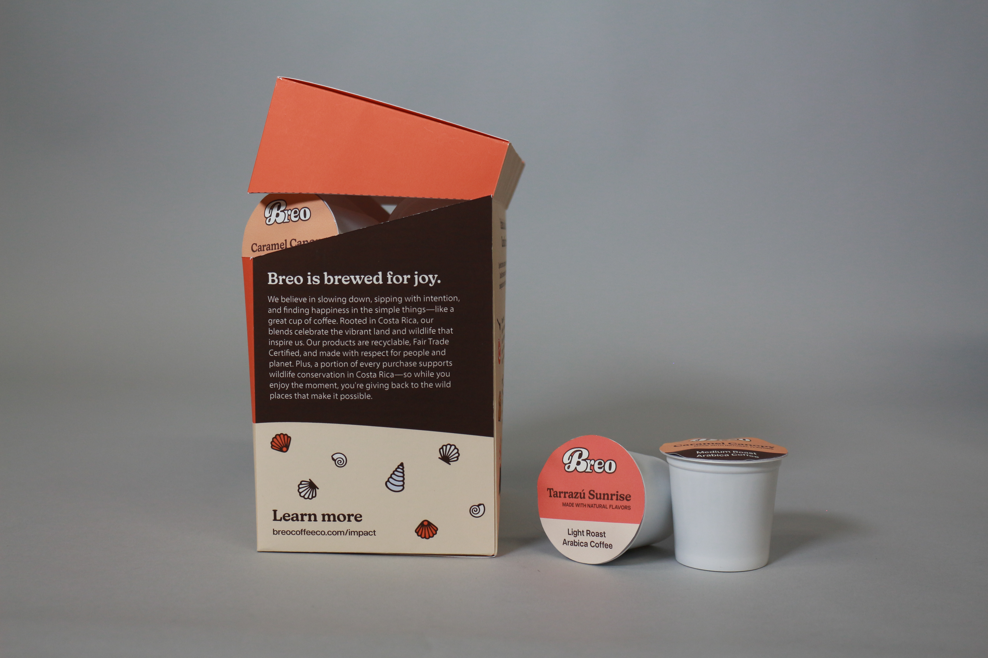
Cold Brew Cans + Eco-Pod Variety pack
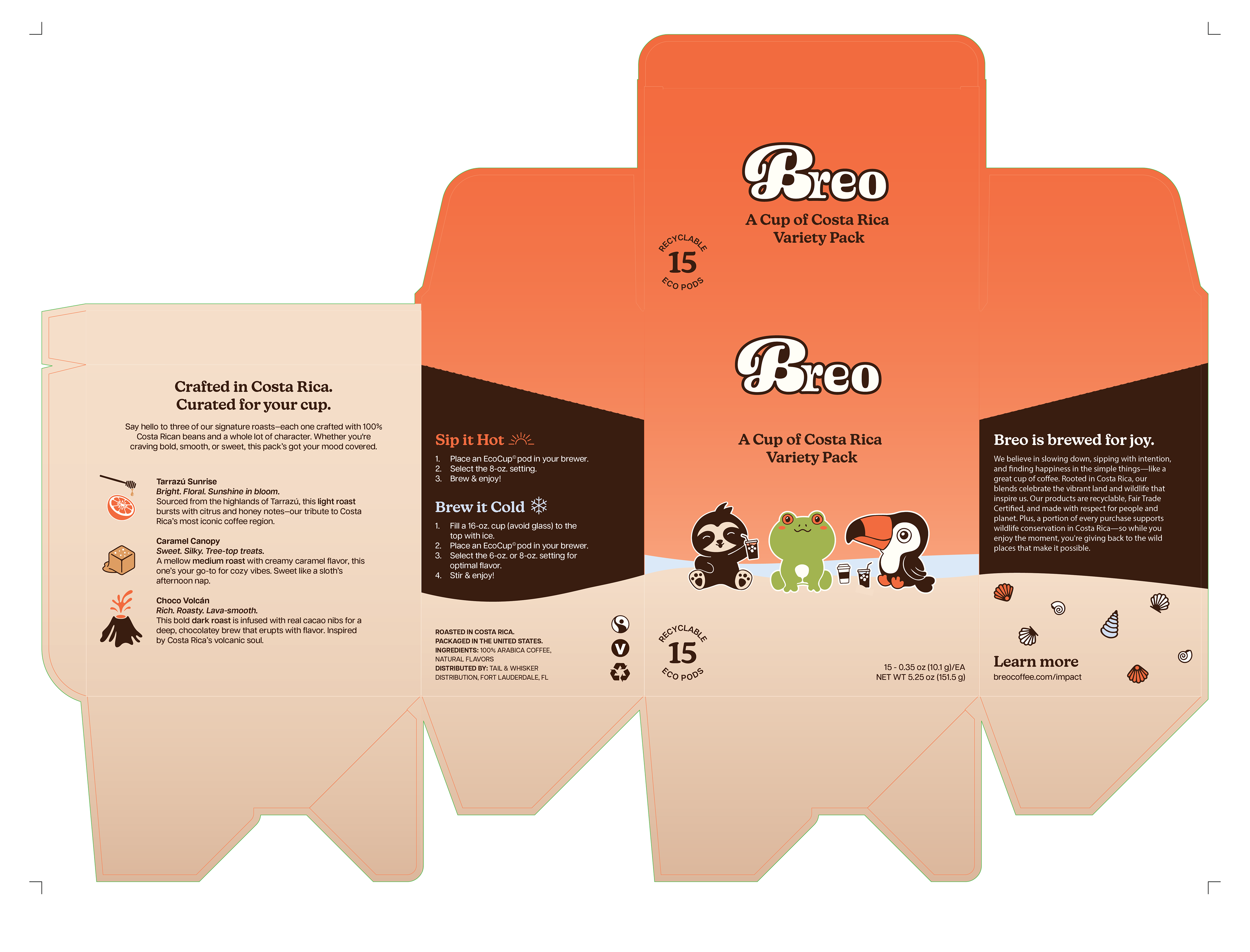
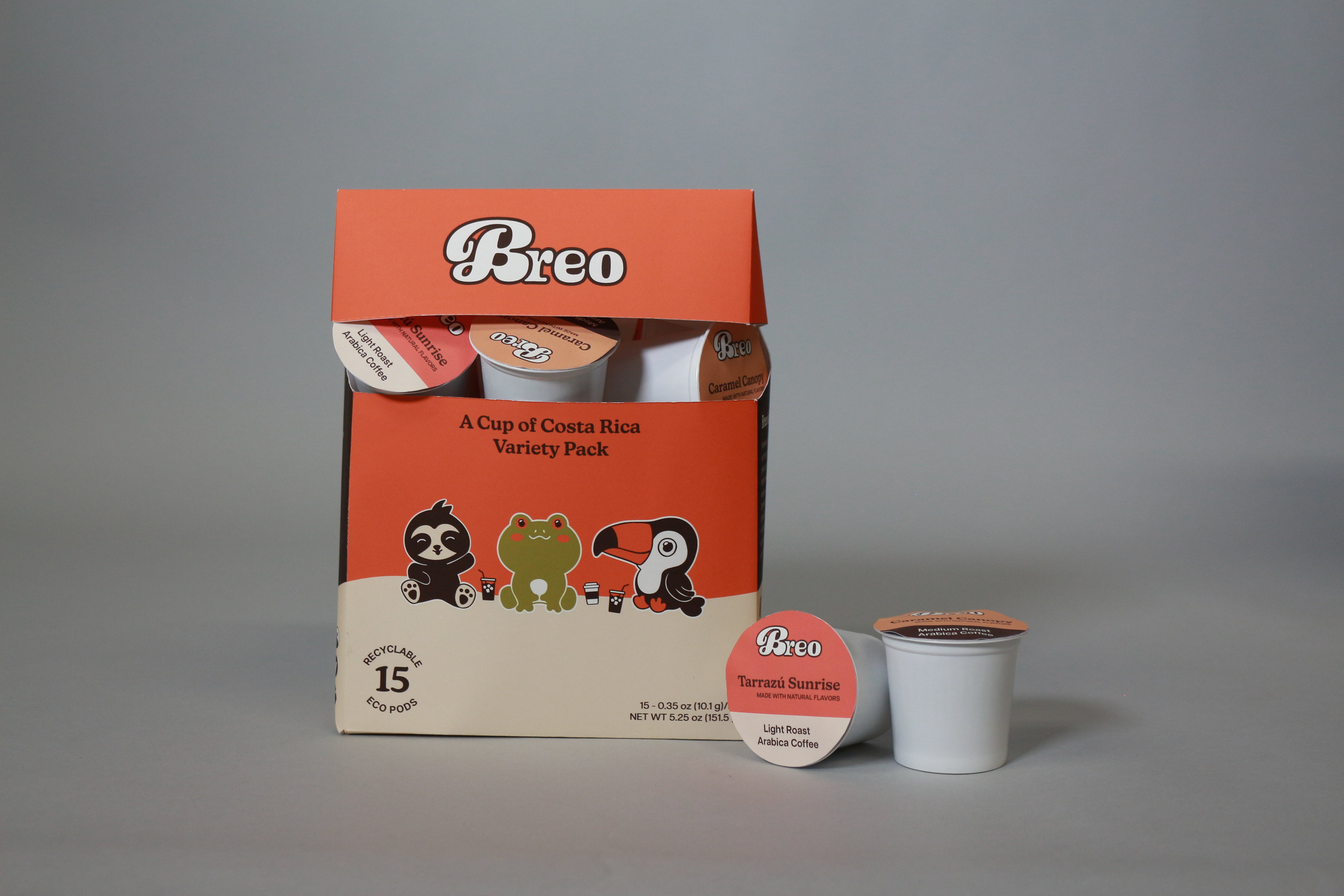
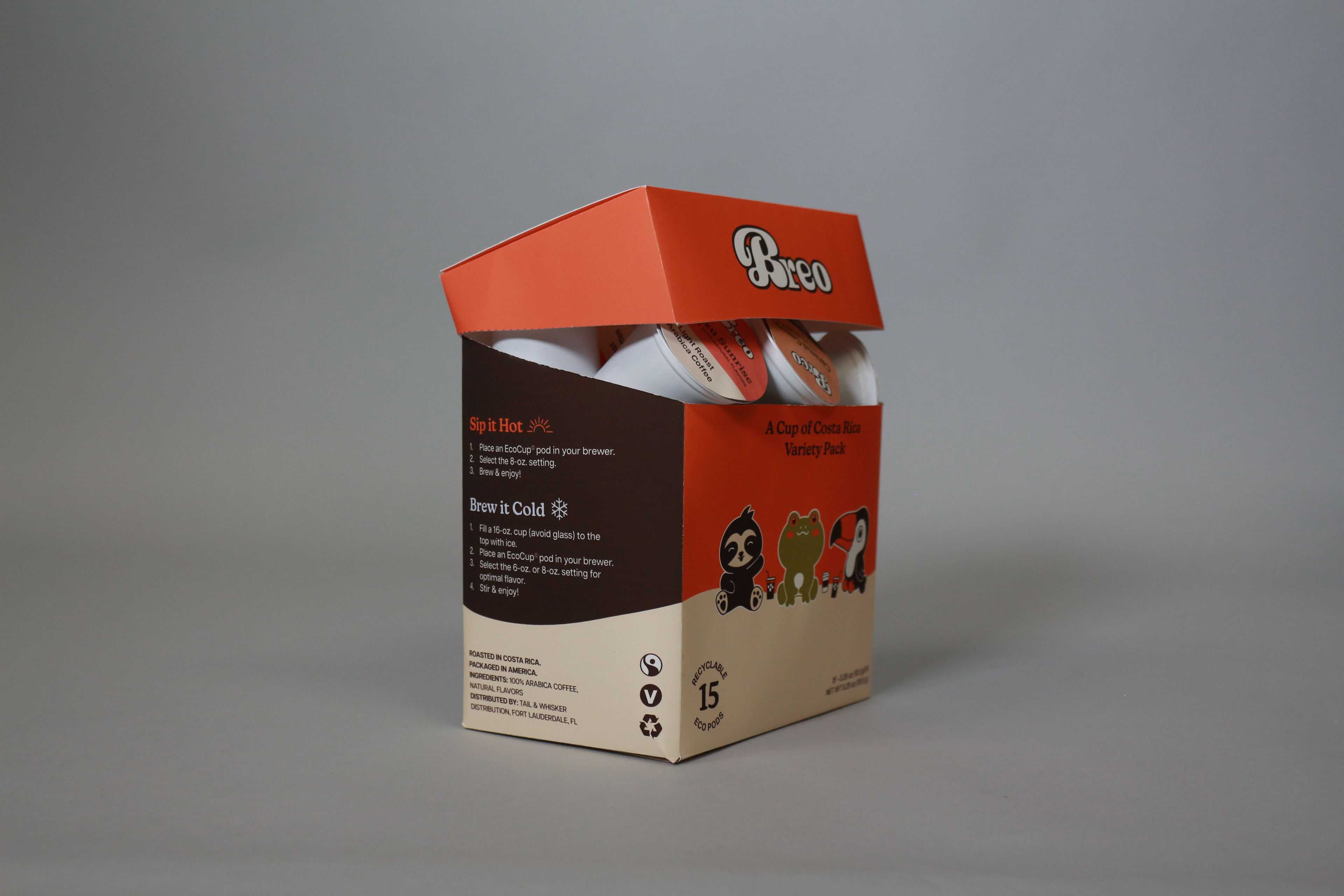
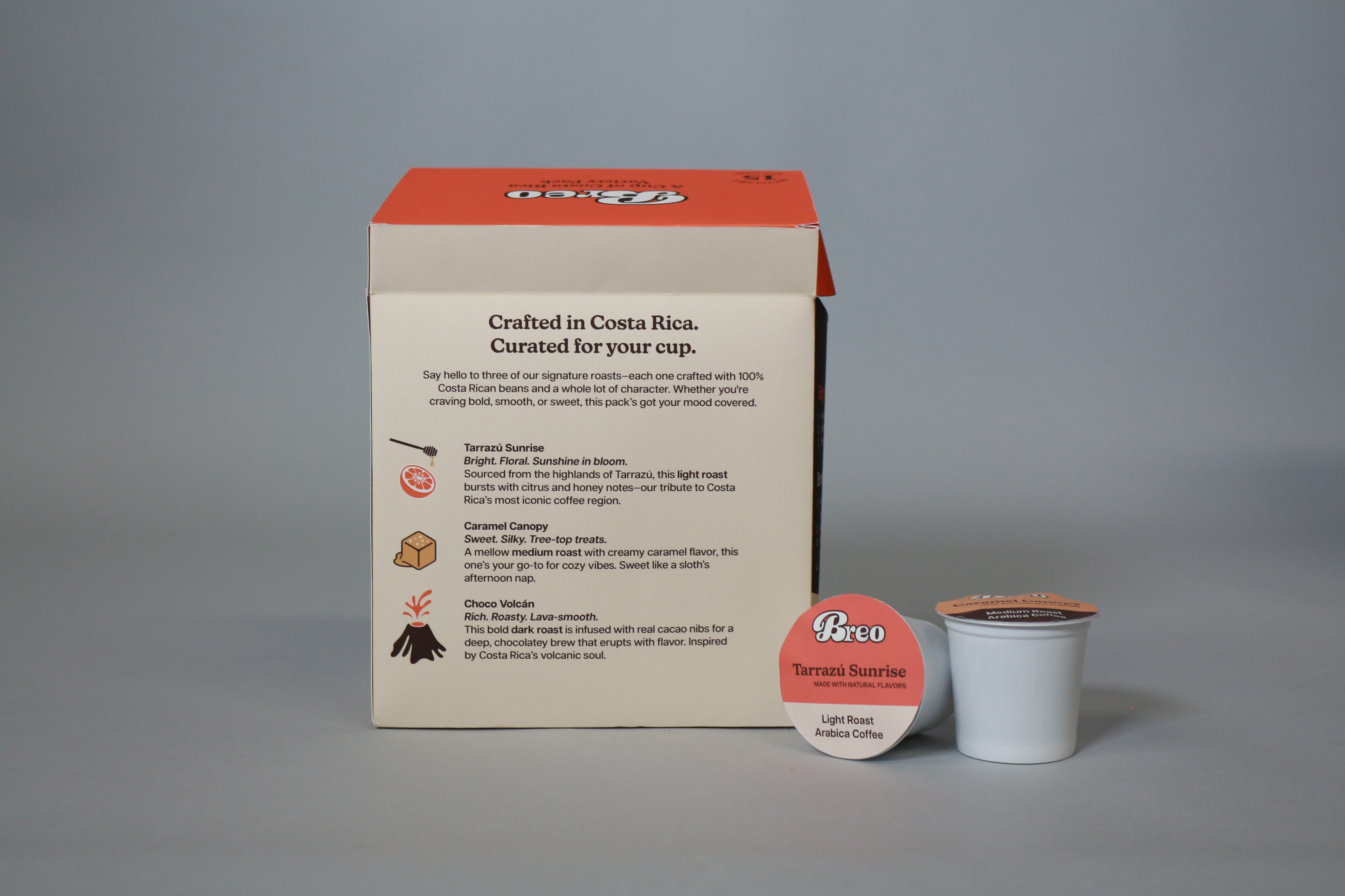
Eco-pod pack dieline
A retail dispenser carton with a flip-top lid, crafted for easy access on busy mornings, late nights, or relaxed hangouts. The principal display panel (PDP) features high-contrast on-brand elements to catch the buyer's attention and visually communicate the product's purpose: eco-friendly coffee pods that can be brewed iced or hot and enjoyed anywhere, anytime.
Merchandise
Stickers + Company Tote